


The Art of Tasteful Collaboration
How to elevate the perception of your brand, by utilizing the audience of another company or designer. (Tekla/Le Crobusier and SSENSE/North Face)

I was recently scrolling through Instagram and I saw a collaboration between Tekla and Le Corbusier. Initially, I thought to myself “How is there a collaboration between an existing bedding and fabric brand, and a guy who died in 1967?” so naturally, I did a bit more research into the collaboration to understand how they are able to label a collection with his name.
So, a quick background on Le Corbusier: his name was Charles-Édouard Jeanneret, he was a Swiss architect who was one of the pioneers of modern architecture. He lacked formal training as an architect and was more attracted to the format of architecture in the artistic sense. He spent much of his time creating paintings and sculptures separate from his architectural work. Some of his most famous work includes: Unité d’Habitation in Marseille, France (1946–52), Villa Savoye in Poissy, France (1931), and Pavillion Le Corbusier in Zurich, Switzerland (1967).
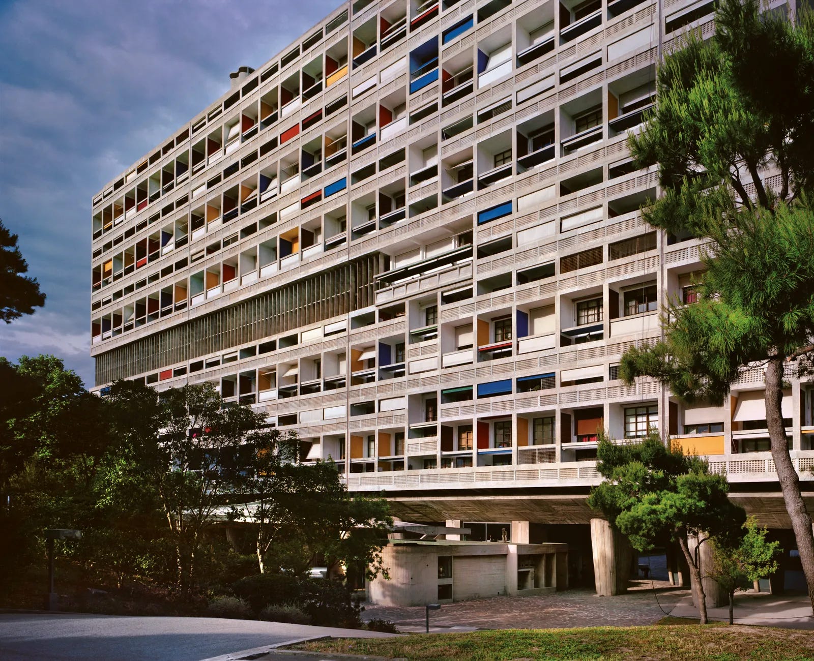
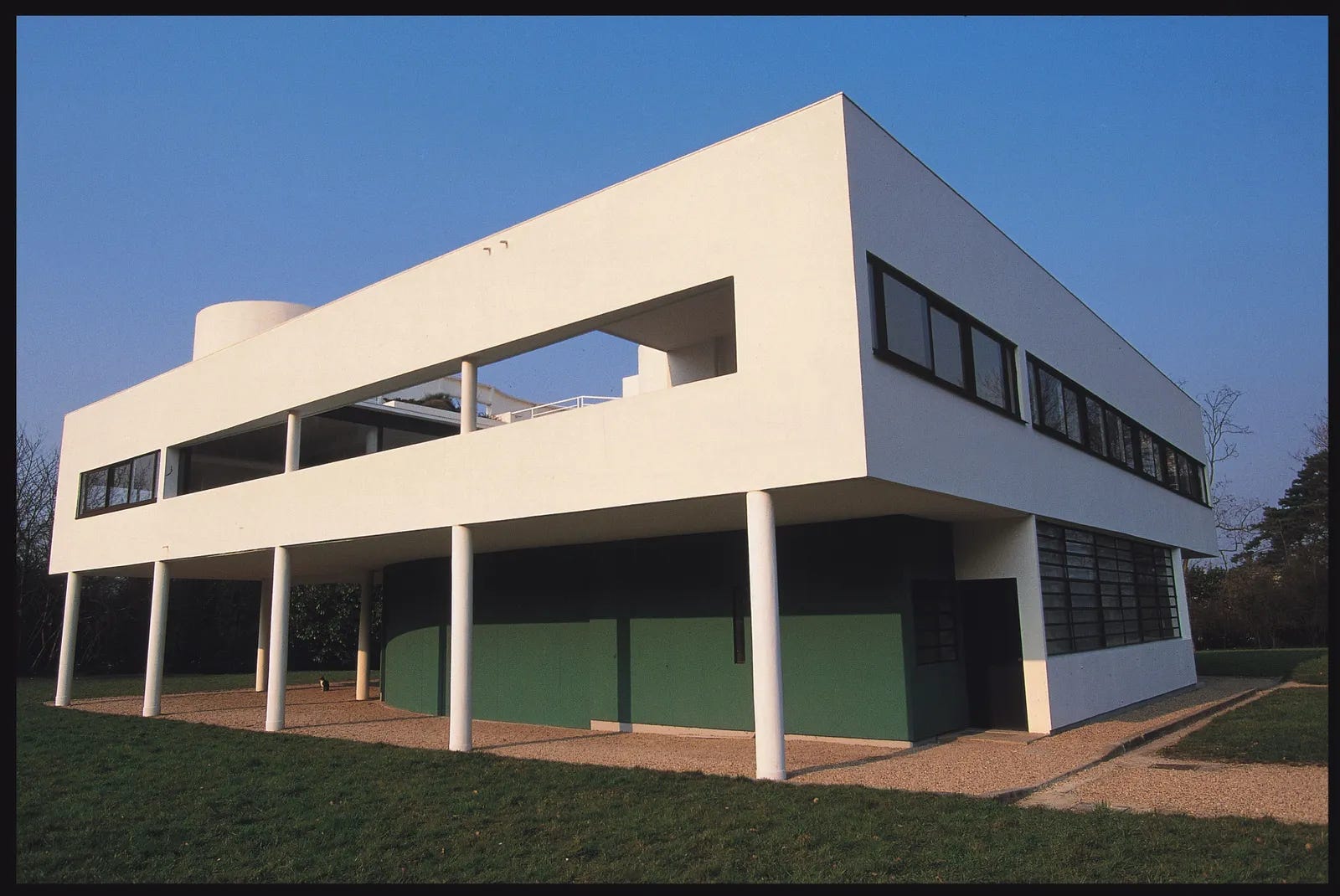
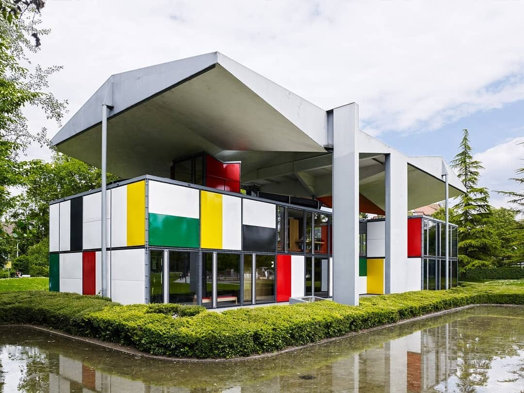
As you can see, Le Corbusier’s style consists of sharp lines and structures that craft a minimalist appearance, while implementing strong colors that resemble the De Stijl style of art from the Netherlands in the 1920s.
Now that we have seen examples of Le Corbusier’s work, you might be thinking: “How could this style be incorporated into a fabric collaboration?” which is also a question I had.
If we take a look at the collection, we can see that Tekla used his color choices as the foundation for their design choices in this collection.
This video uses the home Le Corbusier designed for his parents in Corseaux, Switzerland called Villa “Le Lac” Le Corbusier as a backdrop to showcase the collection. Villa “Le Lac” Le Corbusier was a testing ground for Le Corbusier’s color theory that he personally pioneered called Architectural Polychromy. This color style is what Tekla used as inspiration for the colors of this collection.


So why have I now spent 350 words giving the backdrop of this collaboration?
Because I believe it is a great example of a tasteful collaboration. In order to understand what a tasteful collaboration is, we have to know what the opposite of a tasteful collaboration is.
Let’s take Kith x Giorgio Armani for example. Although the pieces from the collaboration itself do not make you want to stab your eyes out, the area in which the collaboration falls flat is actually the genesis of it.
The overlap between religious Kith fanboys and Giorgio Armani old-money fossils is almost none. There is not a middle of the venn diagram in which there are any wearers of both of these brands prior to this collaboration. This, in my opinion, is what makes a poorly executed collaboration: when the two brands collaborating does not even make sense because their target audiences are so segmented.
This is what Tekla x Le Corbusier gets right. It makes sense. Owners of Tekla products (a luxury fabric brand) are likely going to be more inclined to enjoy the minimalist and modern works of Le Corbusier. Although they might not live in one of the houses he designed, Tekla consumers are likely to still have an appreciation and understanding of his work, due to Tekla’s positioning in the market as a premium-priced, luxury, modern fabric brand.
Tekla has also recently collaborated with Auralee, a Japanese luxury brand. This collaboration, as well as the social campaigns that followed it, have also been very well executed in my opinion, due to the similar positioning in the market from both brands. Also, the Auralee design team can come in and impart interesting design choices on the products, and since the material of both clothes and bedding are the same (fabrics) it is easier to execute design decisions even if the product team isn’t highly specialized in bedding or home fabrics.
The marketing benefit of collaboration is to introduce an audience of another brand to your product in a way that plays to the strengths of both brands. The recent North Face X SSENSE collaboration showcases a very creative take on the 1996 Nuptse Model. Since SSENSE is a luxury online retailer and the North Face is a cult classic brand that is sold on the site, it makes sense to have SSENSE’s design team come in and create a more high-fashion take on a classic model. The creative freedom of the collaboration is most prominently showcased in the marketing campaign for the pieces.
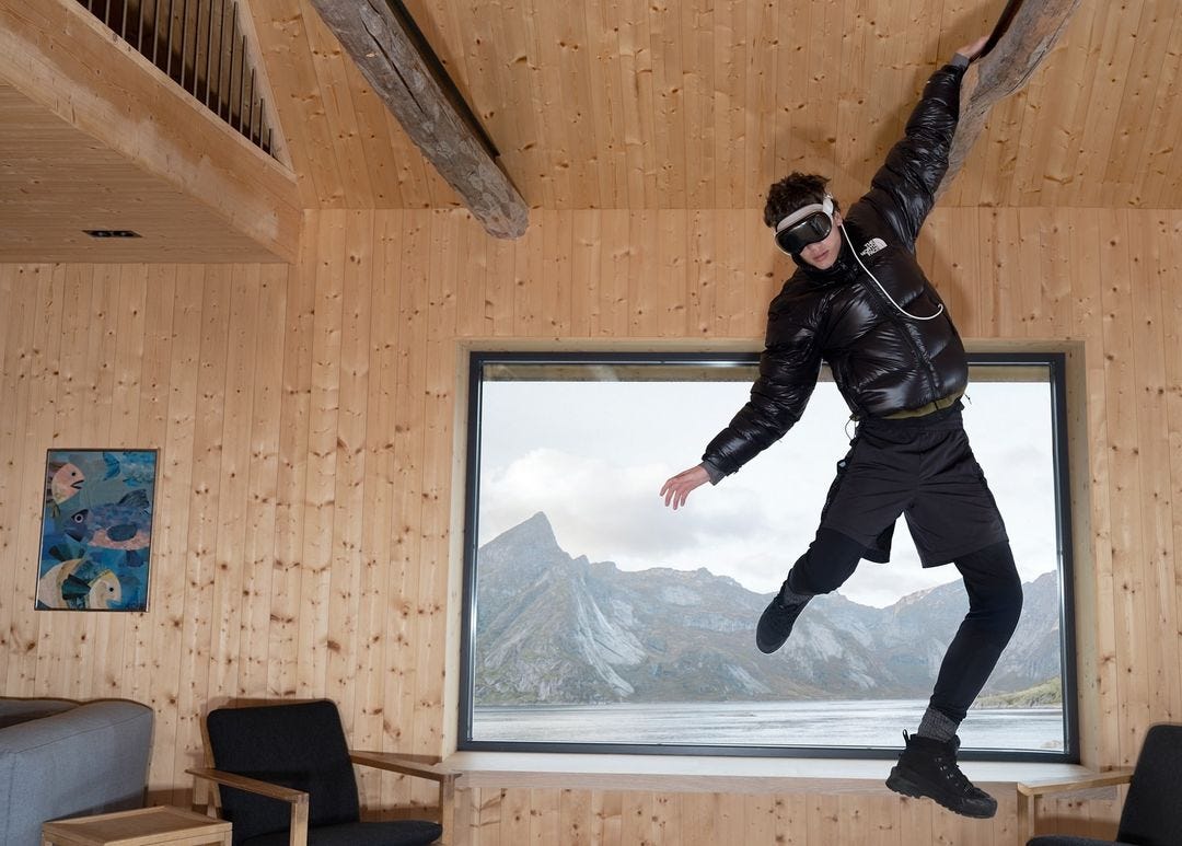
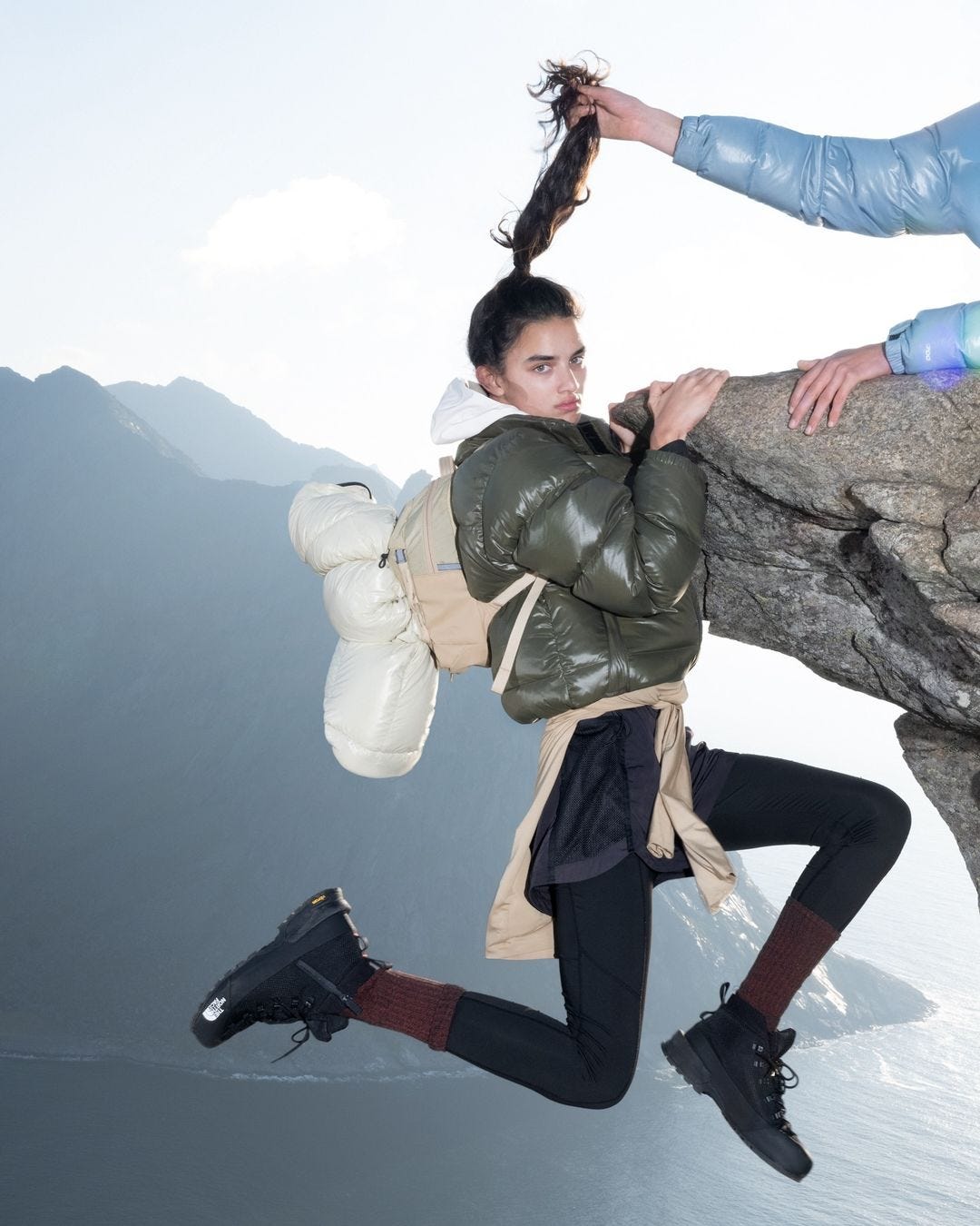
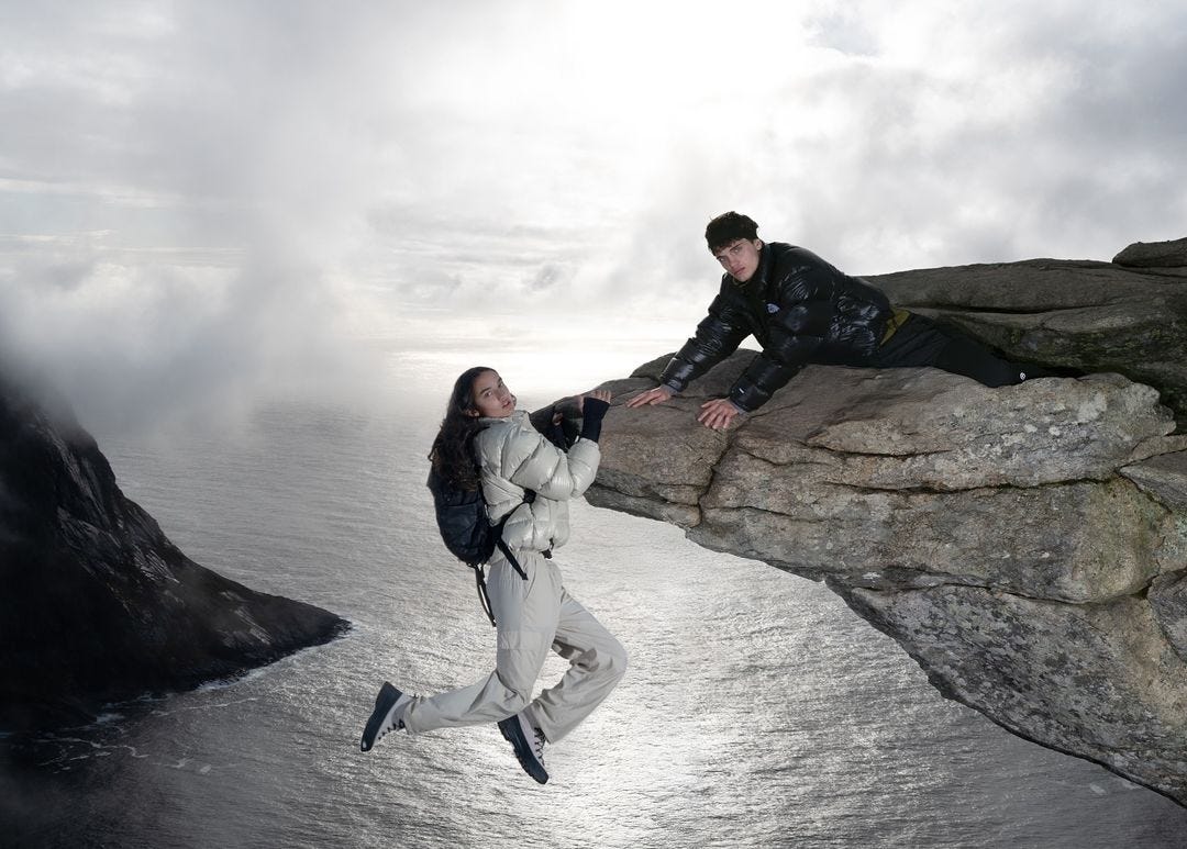
Here, we can see a classic North Face silhouette being presented through a more high-fashion lens, with the art direction of this campaign being relatively experimental compared to a typical North Face campaign. We can see this through the appearance of the models, and the treatment of the images. It gives a surprising and almost wacky feel to the images, exploring a new way to present an otherwise simple, possibly mundane jacket silhouette.
This strategy works well because it displays a classic brand (North Face) to an existing luxury (SSENSE) audience. By presenting the items in a more high-end way, it elevates North Face's positioning within the premium and luxury clothing market, making a new segment of both brands' customer bases more inclined to purchase the product.
A 3D chess move is being played through smart and selective collaboration.
The goal of a collaboration should be to EXPAND the existing customer base (middle of venn diagram) between two brands or to ELEVATE the positioning of the brands in the marketplace. This is how tasteful collaboration is achieved.
A brand that collaborates with everyone (i.e. Kith) is going to tarnish the positioning of the brand, due to the lack of existing consumers (of both brands) prior to collaboration.
P.S.: Would love any feedback on this article and if this style of content around branding/marketing is something you enjoy. Drop thoughts in the comments.
Also, if you or your brand has a desire to execute a more premium style of art/creative direction for social content or other marketing campaigns, shoot me a DM, would love to see where I can help out.


loved it! tekla does so many collabs but i feel like they lack originality (no matter if it’s auralee, jacquemus or corbusier, usually the collab is about the color or thickness of the towel stripes and that’s kinda it) but their campaigns are always so beautifully shot!
last year ssense did 20 collabs for their 20th anniversary with different brands they stock and i quite enjoyed that. a bright blue jil sander sleeping bag, an alien like ceramic vase with knwls, a chess set with marine serre and many other creative pieces, not just co-branded clothes as it usually seems to be nowadays. the prices were crazy but i liked the effort!
Very nice analysis of certain type of collaboration between brands! a recent one that comes to my mind that make no sense imho (no venn diagram area intersection as you said) it the one between Xbox and Gucci 🙃